Lampara LMS is a centralized learning management system designed to simplify how educational content is delivered, managed, and tracked. It allows instructors to create and organize courses, upload learning materials, and monitor student progress in one unified platform. Students can easily access lessons, track their completion, and stay engaged through a clear and intuitive interface. With role-based access and streamlined workflows, Lampara LMS helps institutions and training teams deliver structured learning experiences while reducing administrative complexity
Role
Product Designer – User Research, Visual Design, Interaction and Prototype
Tool Kit
Adobe XD, Adobe Illustrator and Adobe Photoshop
The Problem
Managing learning content and users across a learning platform can quickly become overwhelming. Instructors and administrators often need to navigate through multiple sections just to create courses, upload materials, track progress, or manage student access. This fragmented experience takes time and increases the risk of errors, such as misconfigured courses, missed submissions, or unclear progress tracking. Without a centralized and intuitive system, both educators and learners struggle to stay organized, especially as more courses, students, and learning materials are added.
The Solution
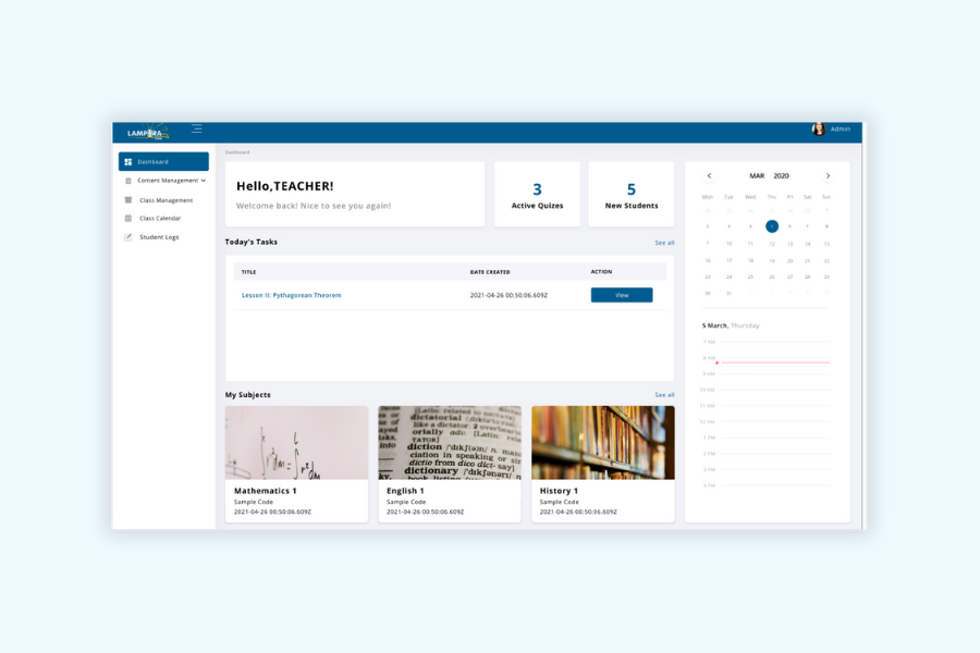
The solution was to design a unified learning management system that centralizes course management, user access, and progress tracking in one intuitive platform. The interface focuses on making key actions such as creating courses, uploading materials, enrolling students, and reviewing progress easy to find and quick to complete. By consolidating these workflows into a single, well-structured dashboard, Lampara LMS reduces cognitive load and allows instructors and administrators to manage learning experiences more efficiently.
The Process
Site Map
Components
Developing the Designs
Starting with Structure I began by mapping out the core screens using high-level frames to quickly explore layout and information hierarchy. This helped establish a clear structure between courses, lessons, progress tracking, and administrative tools early in the process.
Designing Around Key Actions With the structure in place, I focused on the main tasks users needed to complete. These included creating and managing courses, uploading learning materials, enrolling students, and tracking progress. The interface was shaped to make these actions easy to find and logically grouped by function.
Designing with Components To maintain consistency and efficiency, I built a set of reusable components such as buttons, input fields, cards, tables, and modals. This ensured a unified visual language across the platform and allowed the design to scale as more features were added.
Prototyping the Flows I created an interactive prototype to demonstrate key user flows, such as accessing a course, completing a lesson, and reviewing progress. This helped validate navigation clarity and allowed early testing of how users move through the system.
Refining for Clarity and Usability After reviewing feedback, I refined the interface with close attention to spacing, alignment, and visual clarity. The final designs prioritize simplicity and readability to support both instructors managing content and students navigating their learning experience.
1. Designing with clarity reduces complexity Prioritizing clean layouts and clear information hierarchy made it easier to manage complex learning features such as courses, lessons, and progress tracking. A structured interface helped users complete tasks with greater speed and confidence.
2. Early prioritization of user actions matters Designing around core tasks like accessing lessons, managing courses, and reviewing progress kept the experience focused and purposeful. This approach prevented feature overload and supported efficient workflows for both instructors and students.
3. Reusable components improve efficiency Establishing a consistent component system early in the process streamlined the design workflow and made it easier to scale the interface across multiple screens while maintaining visual consistency.
4. Prototyping enables better feedback Interactive prototypes allowed stakeholders to experience real learning flows early on. This resulted in clearer feedback and quicker alignment on usability improvements.
5. Consistency builds trust and usability Maintaining consistent design patterns throughout the platform made navigation more intuitive and reduced the learning curve. This consistency helped reinforce a reliable and professional user experience.

")
")
